
Case Study: Chronos Growth Partners
Introducing Chronos Growth Partners
What happens when a group of award-winning watch dealers and knowledgeable collectors team up? Meet Chronos Growth Partners.
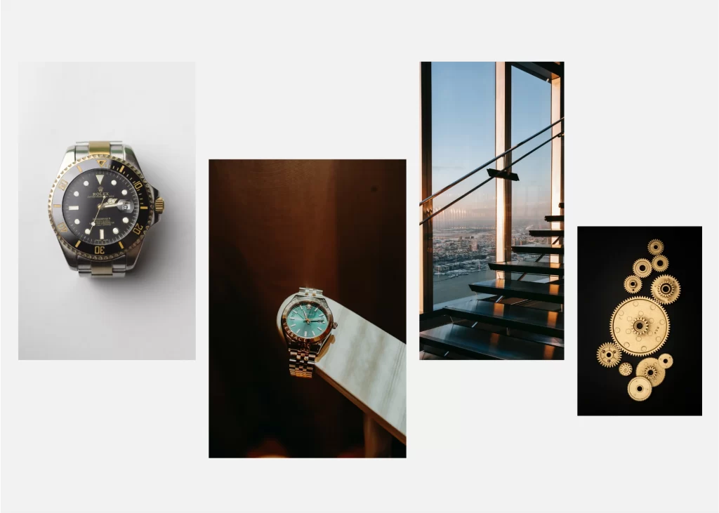
Specialising in the buying, selling and collecting of luxury timepieces, the newly created Chronos Growth Partners Limited (CGP) are a London-based team. Boasting a generational understanding and a deep enthusiasm for the watch industry, they acquire some of the rarest and most coveted timepieces in the market.
Chronos Growth Partners are partnered with industry trusted names, including The Diamond Box, a family business which has traded for 25 years. Meanwhile, their founding partners bring a wealth of experience and expertise. What is their main objective? To share their vast knowledge and expertise, outperform the market and generate long-term returns in the thriving watch industry.
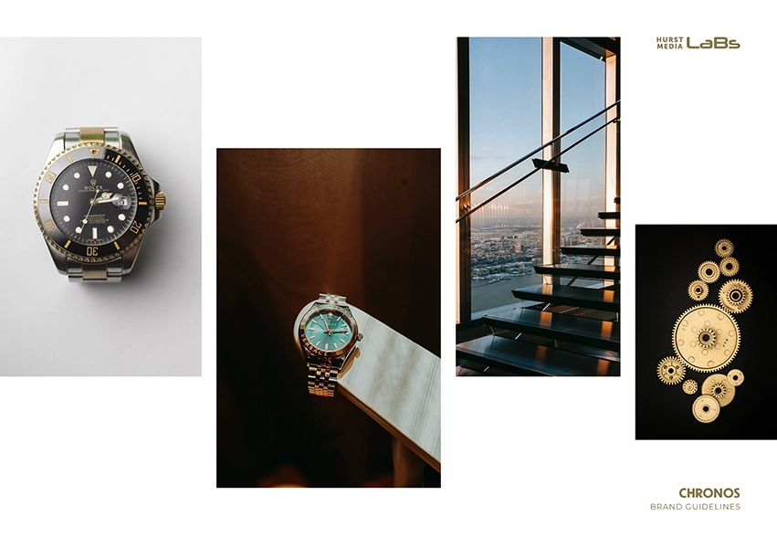
Why ‘Chronos’
Watches and luxury go hand in hand. To come up with a brand name for a watch partnership, is to open a world of possibilities. In the quest for a memorable, appropriate name, we trawled through the archives of history and time till we found our eureka moment.
Exploring the ancient gods of time uncovered suggestions such as Chronos, a name representing that which is everlasting. Precisely the qualities sought by a watch enthusiast.
Chronos, is the personification of time in pre-Socratic philosophy and later literature. Greco-Roman mosaics depicted Chronos as a man turning the zodiac wheel and as a symbol of cyclical time. A name steeped in symbolism and history indeed. Essentially, Chronos is the literal, or that which can be encapsulated and measured, within a watch.
Design process
The design and branding process was as meticulous and precise as time itself…
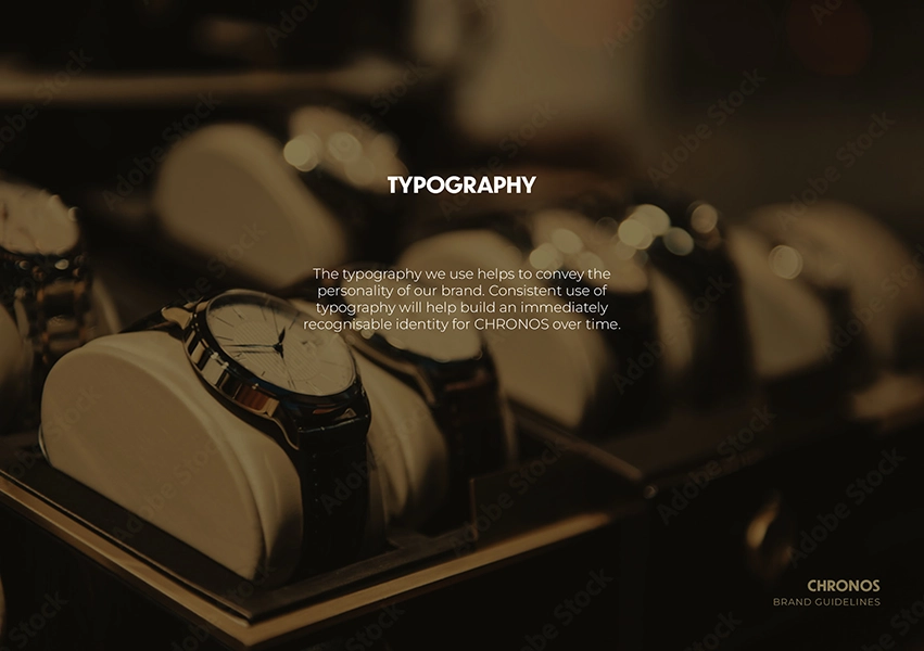
Typography
The typography we use helps to convey the personality of the brand. Consistent use of typography will help to build an immediately recognisable identity for Chronos over time.
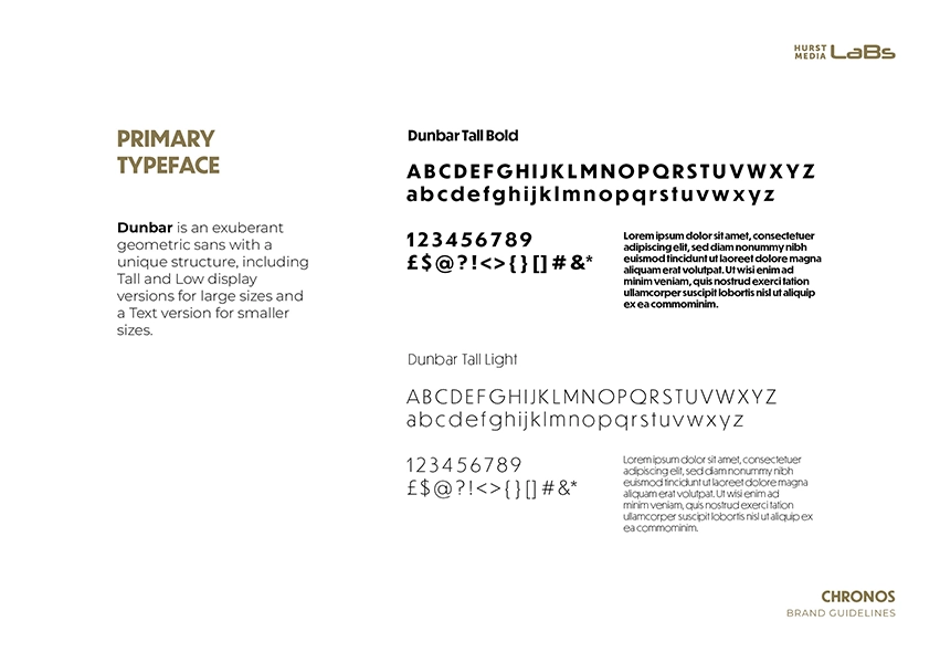
Dunbar, the primary typeface, was originally designed with a view to being retro in more than one way and contemporary in another – a concept which aligns with the core values of Chronos.
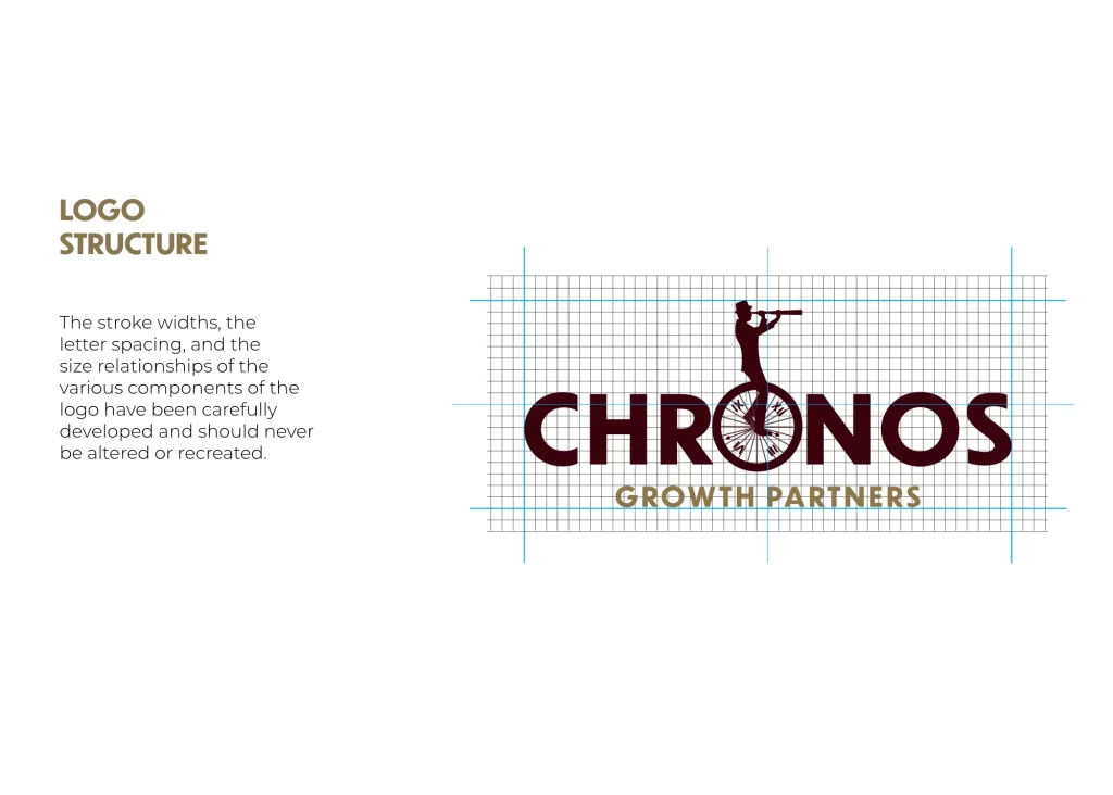
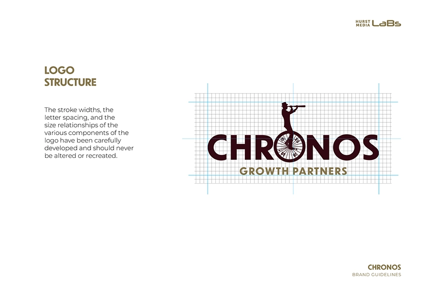
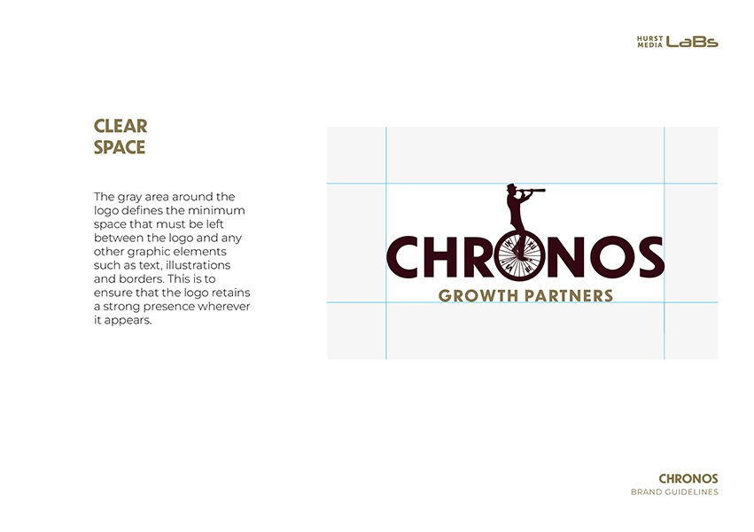
Logo
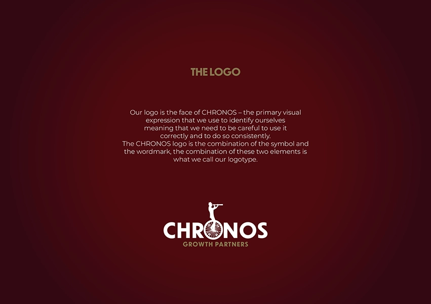
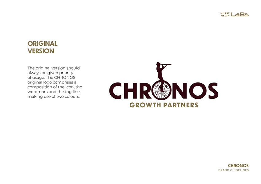
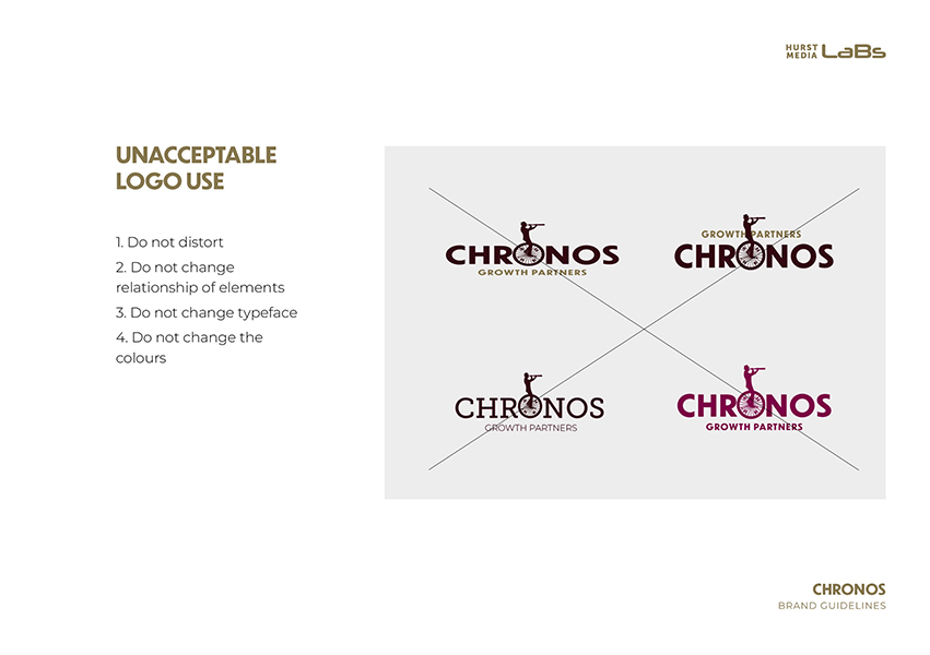
During the foundation of the brand identity, it was imperative that the logo reflected the core values of Chronos Growth Partners. The logo is the face of CGP – the primary visual expression that is used to identify the brand.
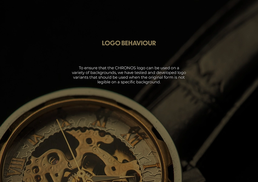
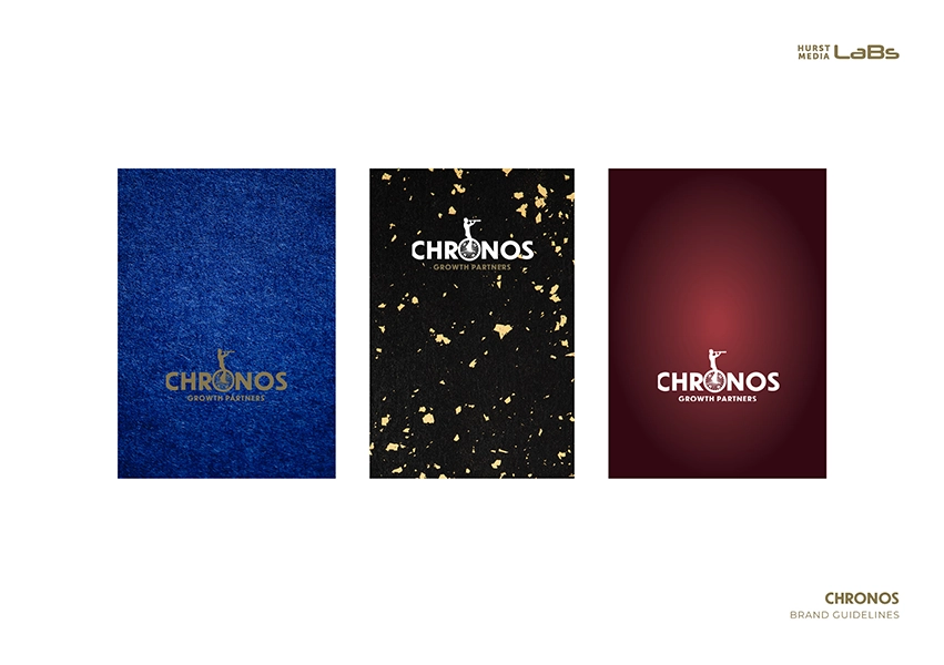
We do not live in a single colour world. People are drawn to interesting design and colour. We were keen for the CGP logo to reflect as such, which can be seen in the final design. The finished logo comprises a composition of the icon, the wordmark and the tagline, making use of two colours.
The logo as a whole is a timely nod to the past, and previous innovations, but also to the future, with the concept of time and moving forward key concepts that Chronos Growth Partners adheres to.

Colour Choices
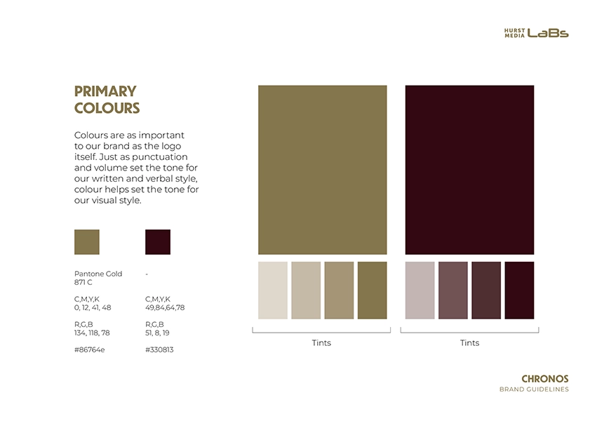
Colours are as important to the brand as the logo itself. Just as punctuation and volume set the tone for written and verbal style, colour helps set the tone for visual style.
Implementing the use of two specific colours for CGP branding, the colours create contrast and make a strong impact, with the two hues working harmoniously together to create a logo that is both visually appealing and meaningful.
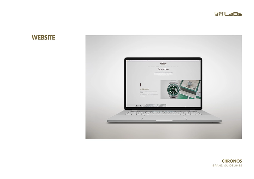
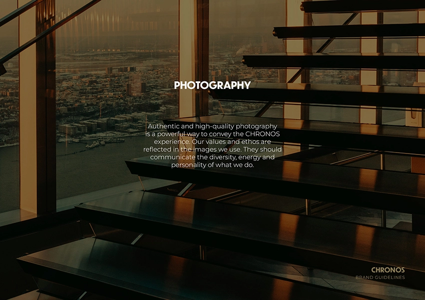
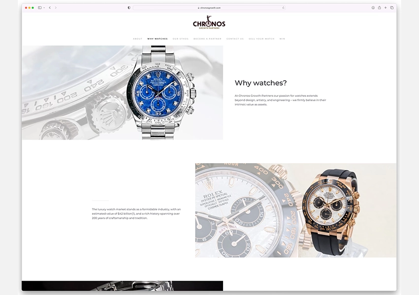
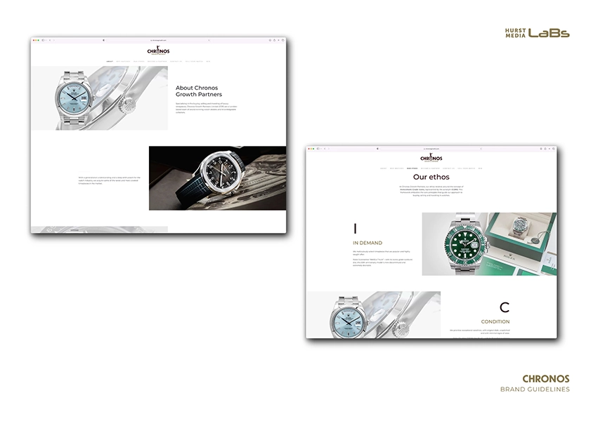
The website
As we began to design the Chronos Growth Partners website, two main themes were at the forefront: credibility and legibility.
The aim of the website is to be a trusted and credible source for watch sourcing. The website is rich with market-relevant facts and statistics, as well as optimised, high-quality imagery. It is imperative that everything on the website must be sourced and consistent with up-to-date market data, in order to be seen as industry leaders. Credibility must run consistently throughout the website.
The text throughout the website also had to be entirely legible. The luxury watch market is quite often an older market, and the fonts and text size had to reflect this. The style implemented was one of sophistication, but not to the point that it might alienate the target reader.